TCM + packaging design stands out with subtlety
Launching first in Hong Kong, TCM + is banking on a blend of dependability and wisdom.
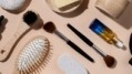
Made-in-Japan beauty products are well trusted among consumers across Asia. And, the long-standing wisdom of herbal medicine resonates with shoppers looking for effective, natural personal care items.
Ageless branding
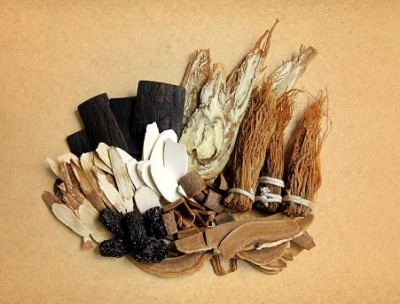
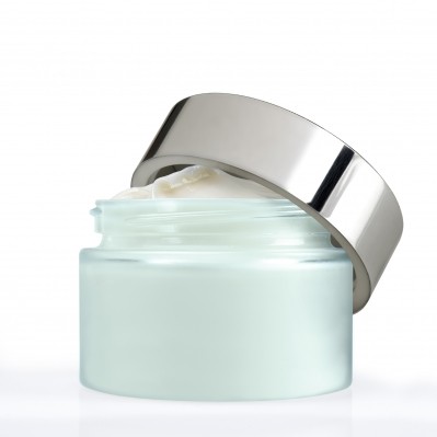
Traditional Chinese medicine (which lends its initials to the TMC + brand name) is premised on mixing beneficial elements to create customized preparations.
Personal care products that offer customization and variable benefits do well with today’s consumers. The company’s products are formulated to be combined by the consumer to meet their particular needs, depending on mood, skin type, time of year, time of day, etc.
“There was a need, at the product development phase, to standardise the oil content and pH levels to prevent separation, and special processes in manufacturing also allow scents to change depending on the amount of mixing,” explains a post on the Nendo site. That accounts for the “plus” in TCM +. Each consumer can add up the items in their own custom care routine.
The brand suggests that consumers follow their intuition and “customize your routine every day and restore harmony to your skin.”
Conceptually vibrant
Nendo’s design is phenomenally complex for all its simplicity.
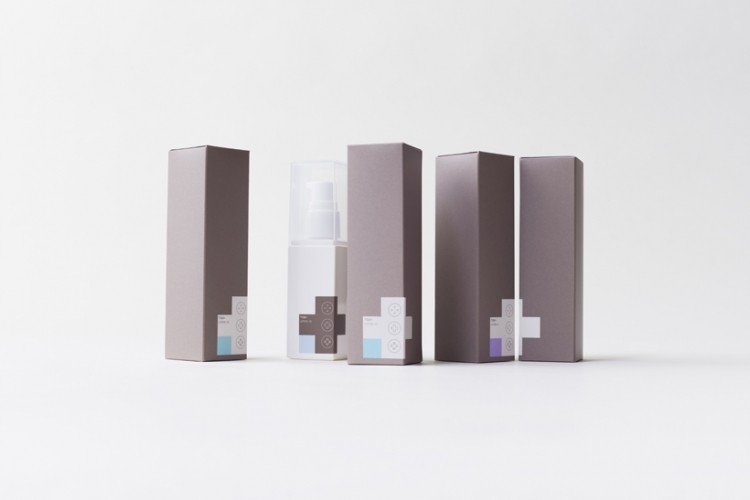
Every element of the logo and packaging communicates the TCM + brand identity. The plus sign imagery inspires blending of products and the containers. In some cases, the plus “appears when lining up the various products with different properties on a shop or cabinet shelf, ” explains the Nendo post.
The packages are mostly grey and white, with a few pastel shades. The color values evoke the durable calm of natural materials. While, the shape of the brand logo and the larger image on the package seamlessly mirror one another. “The minimal packaging design was based around the image of the cross – an internationally recognised symbol of healthcare. Crosses also form the company logo, made out of the letters T, C and M,” explains a recent article in Dezeen magazine.
Good looks
Nendo created stackable packaging for Three Cosmetics, which is also a Japanese brand.
The studio, however, designs with an artistry that is industry agnostic: “We design basically everything, from graphic design, to product design, industrial design, a lot of interiors and architecture as well,” explains Oki Sato, founder and chief designer of Nendo, in a short video about the TCM + packaging design.


![Latest developments from the South Korean beauty market. [Getty Images]](/var/wrbm_gb_food_pharma/storage/images/_aliases/wrbm_tiny/publications/cosmetics/cosmeticsdesign-asia.com/headlines/brand-innovation/korea-focus-able-c-c-kolmar-and-more-in-this-k-beauty-round-up/17357973-1-eng-GB/Korea-focus-Able-C-C-Kolmar-and-more-in-this-K-beauty-round-up.jpg)

![Able C&C has furthered its partnership with Japanese discount chain Daiso with new makeup launch. [A'pieu]](/var/wrbm_gb_food_pharma/storage/images/_aliases/wrbm_tiny/publications/cosmetics/cosmeticsdesign-asia.com/headlines/brand-innovation/a-pieu-and-daiso-launch-exclusive-2-makeup-line/17339117-1-eng-GB/A-pieu-and-Daiso-launch-exclusive-2-makeup-line.jpg)
![Down Under Enterprises is setting sights on the Asian market as environmental sustainability and traceability become increasingly important. [Getty Images]](/var/wrbm_gb_food_pharma/storage/images/_aliases/wrbm_tiny/publications/cosmetics/cosmeticsdesign-asia.com/headlines/market-trends/down-under-enterprises-shifts-focus-to-china-as-environmental-sustainability-traceability-come-into-the-spotlight/17304932-1-eng-GB/Down-Under-Enterprises-shifts-focus-to-China-as-environmental-sustainability-traceability-come-into-the-spotlight.jpg)
![News updates from Shiseido, Dr.Ci:Labo, Sephora, and more. [Shiseido]](/var/wrbm_gb_food_pharma/storage/images/_aliases/wrbm_tiny/publications/cosmetics/cosmeticsdesign-asia.com/headlines/brand-innovation/updates-from-shiseido-dr.ci-labo-sephora-and-more/17334944-1-eng-GB/Updates-from-Shiseido-Dr.Ci-Labo-Sephora-and-more.jpg)

![Clariant has underscored the importance of localisation strategies and distribution capabilities in China with beauty trends evolving at a rapid pace. [Getty Images]](/var/wrbm_gb_food_pharma/storage/images/_aliases/wrbm_tiny/publications/cosmetics/cosmeticsdesign-asia.com/article/2024/04/16/clariant-emphasises-importance-of-localisation-in-the-era-of-viral-trends/17327969-1-eng-GB/Clariant-emphasises-importance-of-localisation-in-the-era-of-viral-trends.jpg)