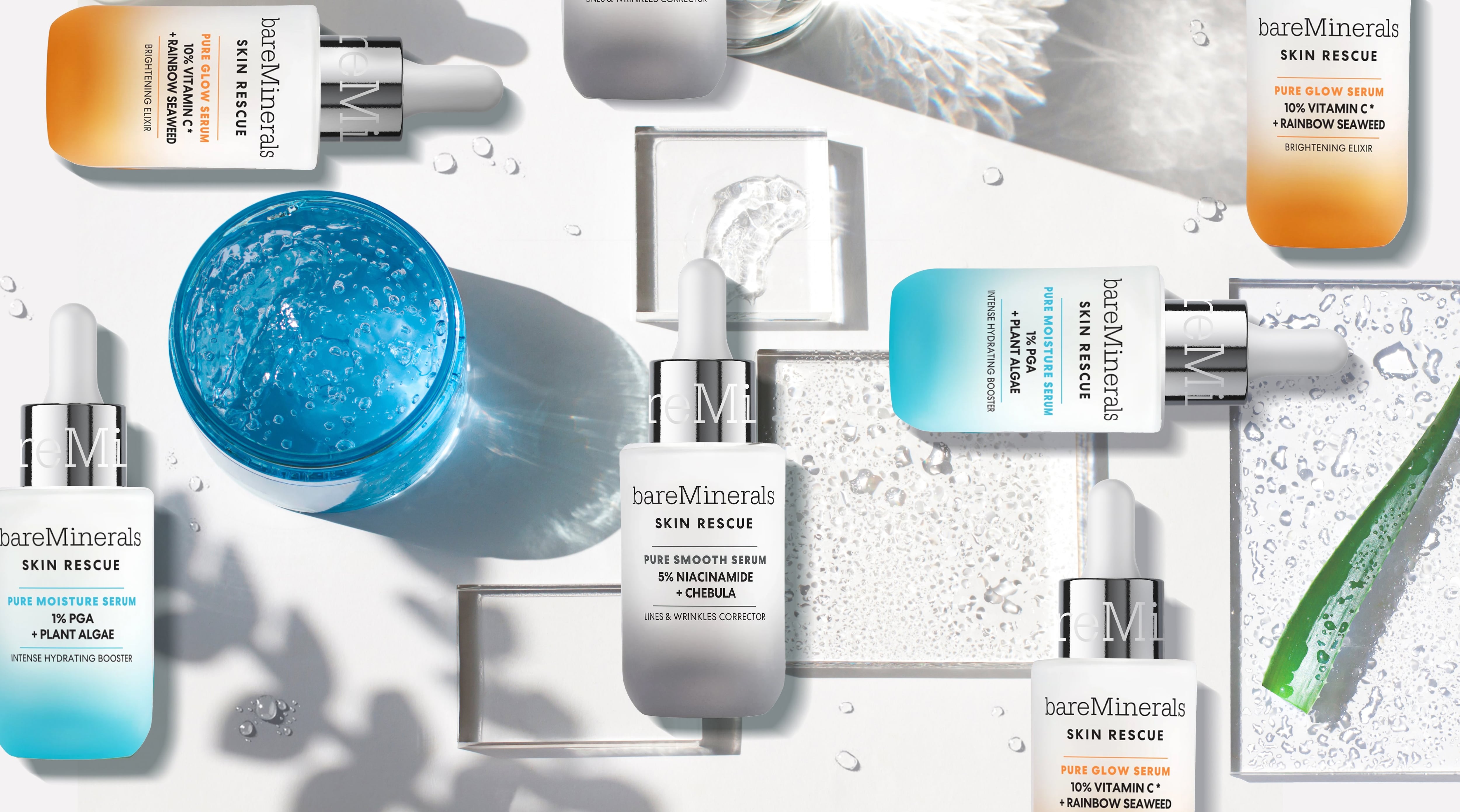
Cosmetics brand bareMinerals recently launched a range of three high-potency facial serums, Skin Rescue, which are suitable for sensitive skin and offer multi-purpose and multi-repair benefits.
According to the brand, the formulations give clinical results from the first use – therefore it wanted to communicate the range as both a ‘clean’ and ‘clinical’ product: AKA a ‘cleanical’ product via the packaging design.
According to BareMinerals' global marketing executive director, Mathilde Le Fevre, the new launch was a “continued commitment to innovation, integrity, and inclusivity.”
She shared that the brand wanted the design to reflect dedication to scientific precision: communicating the efficacy and purpose of each serum through the packaging.
Indeed, more beauty shoppers are demanding both ingredients’ transparency and efficacy.
Consumers are actively seeking out doctor-based or pharmacy-style derma skin care brands, while simultaneously analysing the INCI list with a laser focus to ensure there aren’t any ingredients lurking in the formulation that they may consider ‘unclean’ or unwanted.
Communicating ‘cleanical’ cosmetics via pack design
From a design perspective, the packaging trend for doctor-based brands such as Dr Barbara Sturm or Skinceuticals, and the ‘French pharmacy-style’ brands, such as Bioderma, La Roche-Posay or Eucerin, has always been extremely minimalistic and reminiscent of medical products.
Meanwhile many ‘clean’ beauty products have generally used the pack to communicate an air of ‘naturalness’ for the ingredients – perhaps with images of the botanicals or crops that are used in the formulation.
So how can prestige cosmetics brands illustrate both clean and clinical attributes using the pack design?
London-based design agency Free The Birds designed the packaging for the new bareMinerals Skin Rescue serum range, which it said “is aimed at a Gen Z audience.”
Co-founder & managing partner at Free The Birds, Nick Vaus, shared more on the agency’s thought process behind the look: “In a market that is growing at incredible speed, the brand required an injection of fresh thinking to create a clear point of difference alongside a premium look, he explained.
“I think that today, there is such a developed, informed consumer at play that beauty brands can (and should) operate with greater transparency when it comes to ‘clean’ claims. This is combined with less of a strict expectation that clean means ‘natural’, more so an understanding of the importance of certain scientific ingredients, alongside ingredients which should be avoided.”
"Natural cues have been smashed"
Vaus highlighted the industry’s growing issue of ‘cleanwashing’ and how the brands can no longer portray themselves as being ‘natural’ or ‘clean’ without the ingredients and the science to back it up.
He even goes as far as to say that “natural cues in design have been smashed.”
“With the growing influence of K-beauty and glass skin, DTC brands showcasing clean, science-based design – it is this form of design which triggers the view of clinical, safe, and efficacious products,” Vaus continued, and shared that he thinks safety is interpreted as “a clean, white lab coat form of design.”
Once this is underpinned, it is through other forms of communication to consumers that the influence of nature can be emphasised,” he explained, adding that skincare enthusiasts are “more capable of recognising powerful, positive ingredients than ever before – as well as those which can have a negative impact on their skin health.”
When creating the new packaging, the agency used the key ingredients in the formulation as a focus, along with a gradient of colour that “not only acts to make the products pop on shelf but “also serves to prevent over-complication of the design to allow the ingredients to shine,” according to Vaus.
As bareMinerals is known for its minimal aesthetic, the agency “built on these cues with a transition into the new serums using a potent ombre colour blush.”
“Designed to communicate the effectiveness with which the new serums are blended into the skin, the ombre applied to each product speaks to seamless application and absorption,” Vaus continued.
“The serum is further elevated with the use of glass and metal materials, to speak to the importance of this step in a skincare routine; a precious elixir applied before the moisturiser.”


